Nirin – Biennale of Sydney
Client
Biennale of SydneyDate
2020Type of work
Brand design
Design
Website design
The edge is the centre
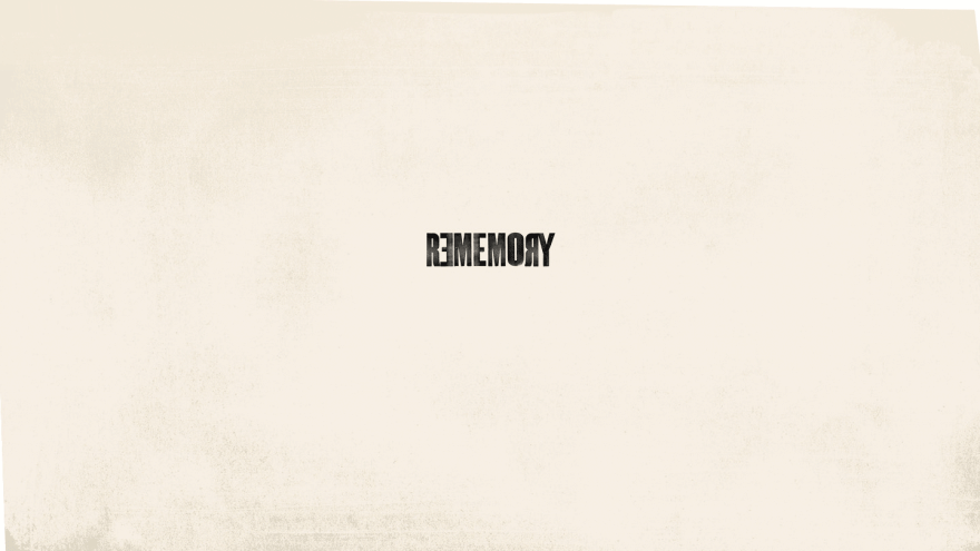
Artistic Director, Brook Andrew’s vision for the Biennale began with the simple idea that ‘the edge is the centre’. NIRIN means “Edge” for the Wiradjuri people of Western New South Wales. The apologetic brand mark stands loud and proud. Alphabet deliberately employed the most readily available, simple and bold, universally accessible typeface there is – Arial Black.
The Biennale is essentially an event created to resonate and be available to all. The majority of exhibitions are free and the work displayed is sourced from all over the globe. Without embellishment or ornamentation, the design cuts through the surrounding visual clutter and allows for the potency of the artist’s work to be elevated to a prime position.
Brand design execution is always bold, confident and self-aware. Keeping the colour palette, typography and layout as minimal as possible, black and white only, the design operates from a rigid foundation of symmetry, informed by the meaning of NIRIN. The central axis always dictates layout and design with all support in communication responding accordingly.
No design acrobatics here.
Simplicity was key.


Alphabet oversaw and produced a vast range of collateral – a comprehensive signage system applied across Cockatoo Island and other collaborating galleries including the Museum of Contemporary Art and Art Gallery of NSW through to City of Sydney street flags, Website, digital activation and out door media.