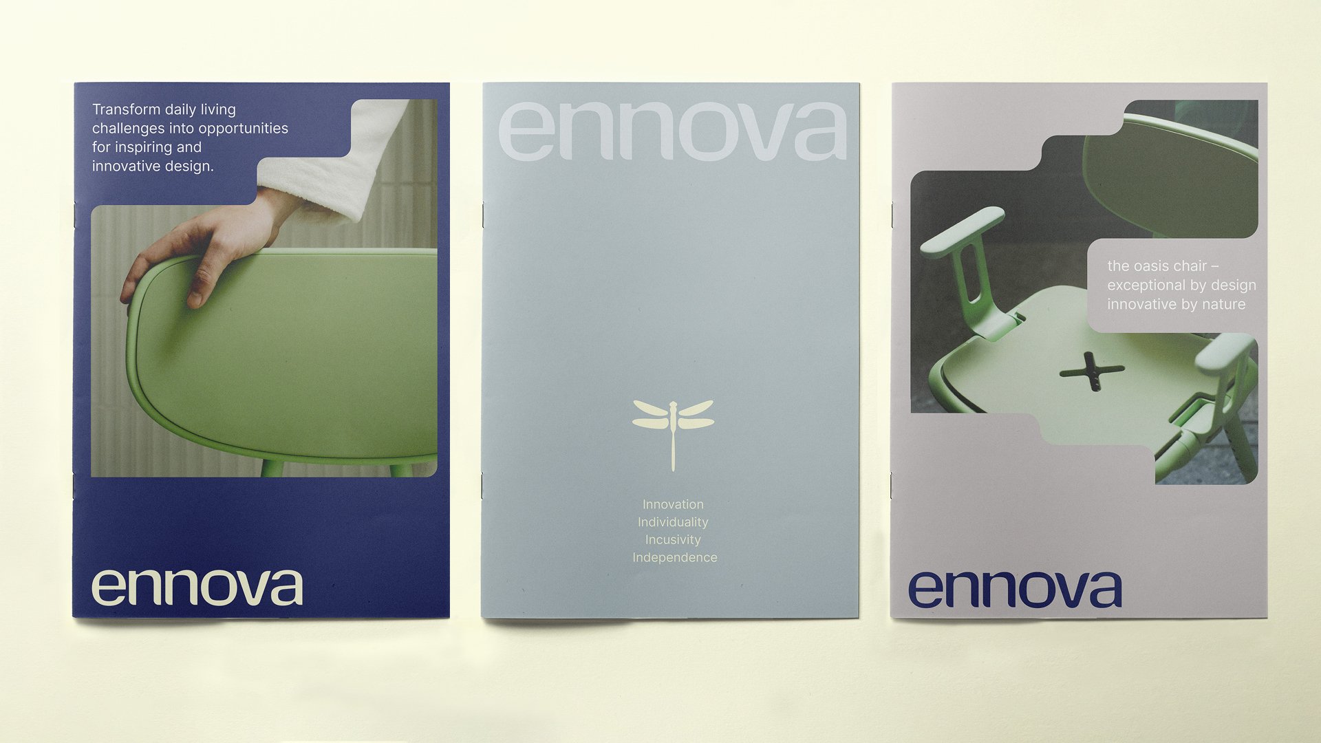
Ennova Brand identity
Client
EnnovaCredits
Photography: Leif Prenzlau
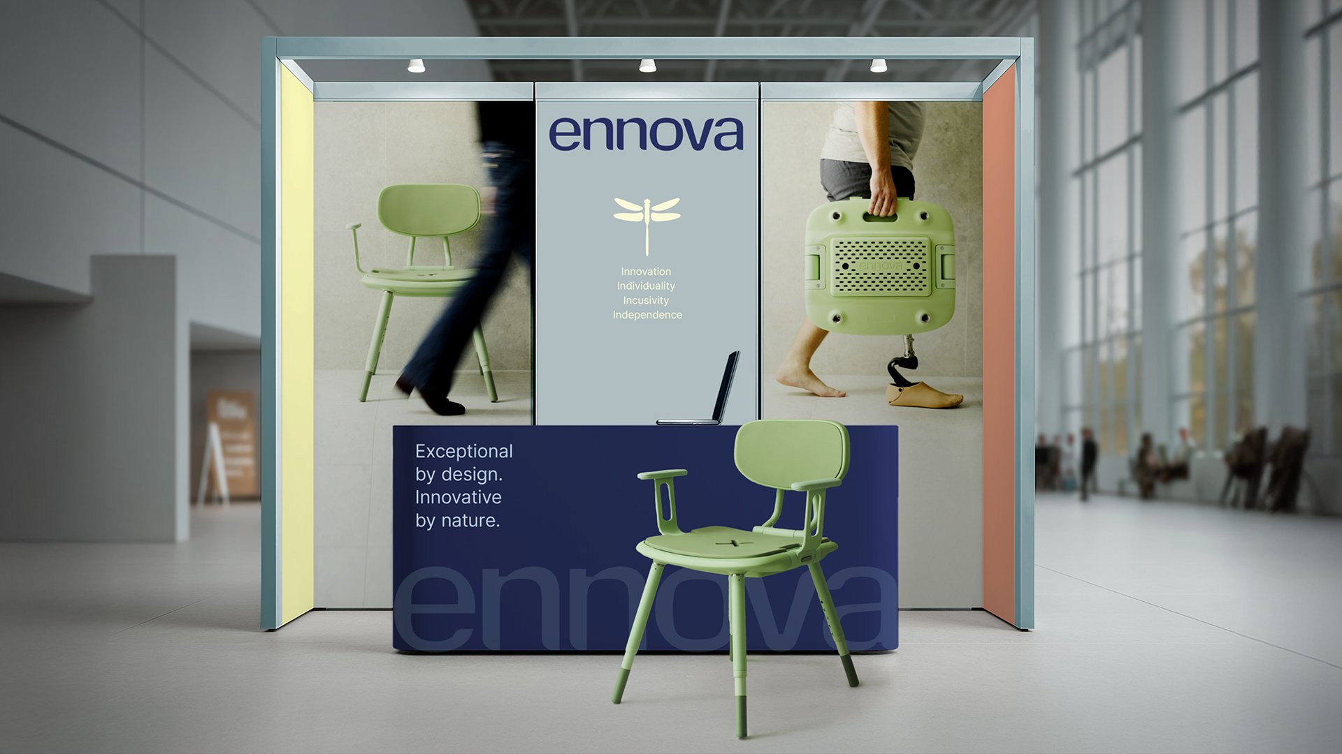
Innovative by nature. Exceptional by design.
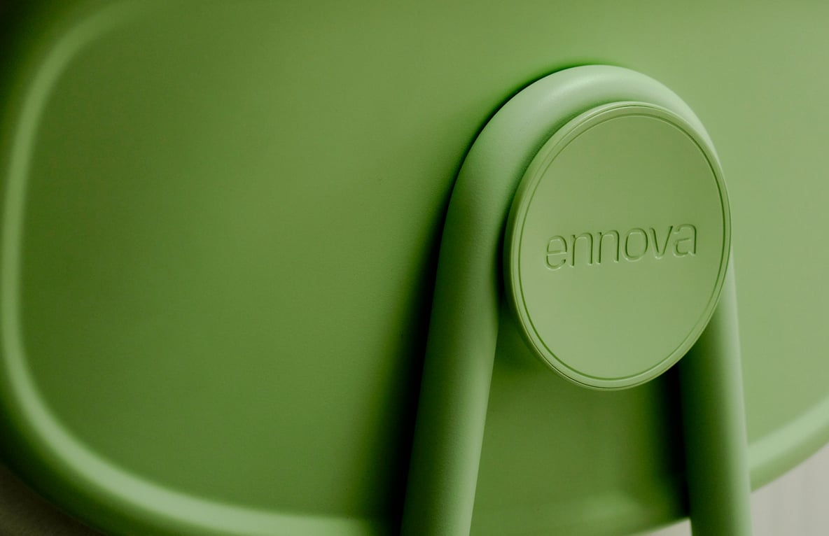
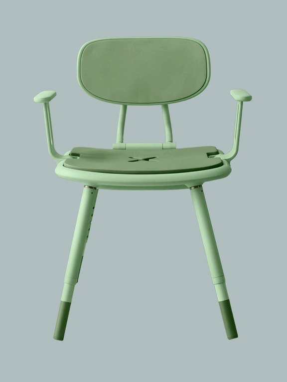
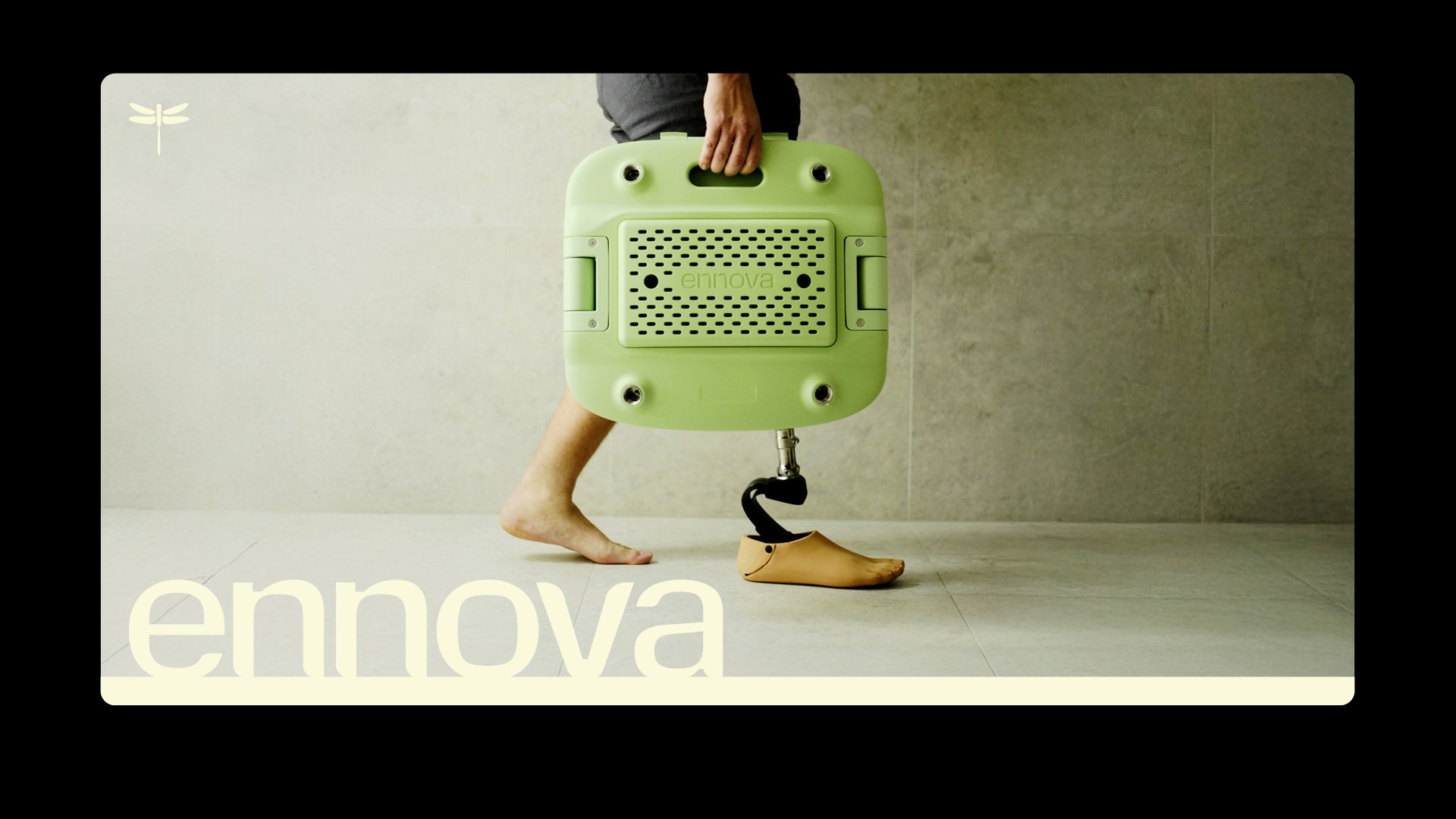
We developed a complete brand identity by stripping away the visual language typically associated with assistive products. In its place, a considered, welcoming design system emerged, drawing on cues from contemporary furniture, architecture, and human-centred design. The result is a brand identity that reframes assistive technology as something purposeful, thoughtful, and quietly confident — a visual language which is contemporary and considered within a sector that primarily communes with challenging and often confronting circumstances.
Alphabet developed a logotype and identity system using a balance of technical and organic forms, taking our cues from the ergonomic approach to the design of Ennova’s assistive care products. The Ennova palette is calm and welcoming. A combination of colours that embodies confidence.
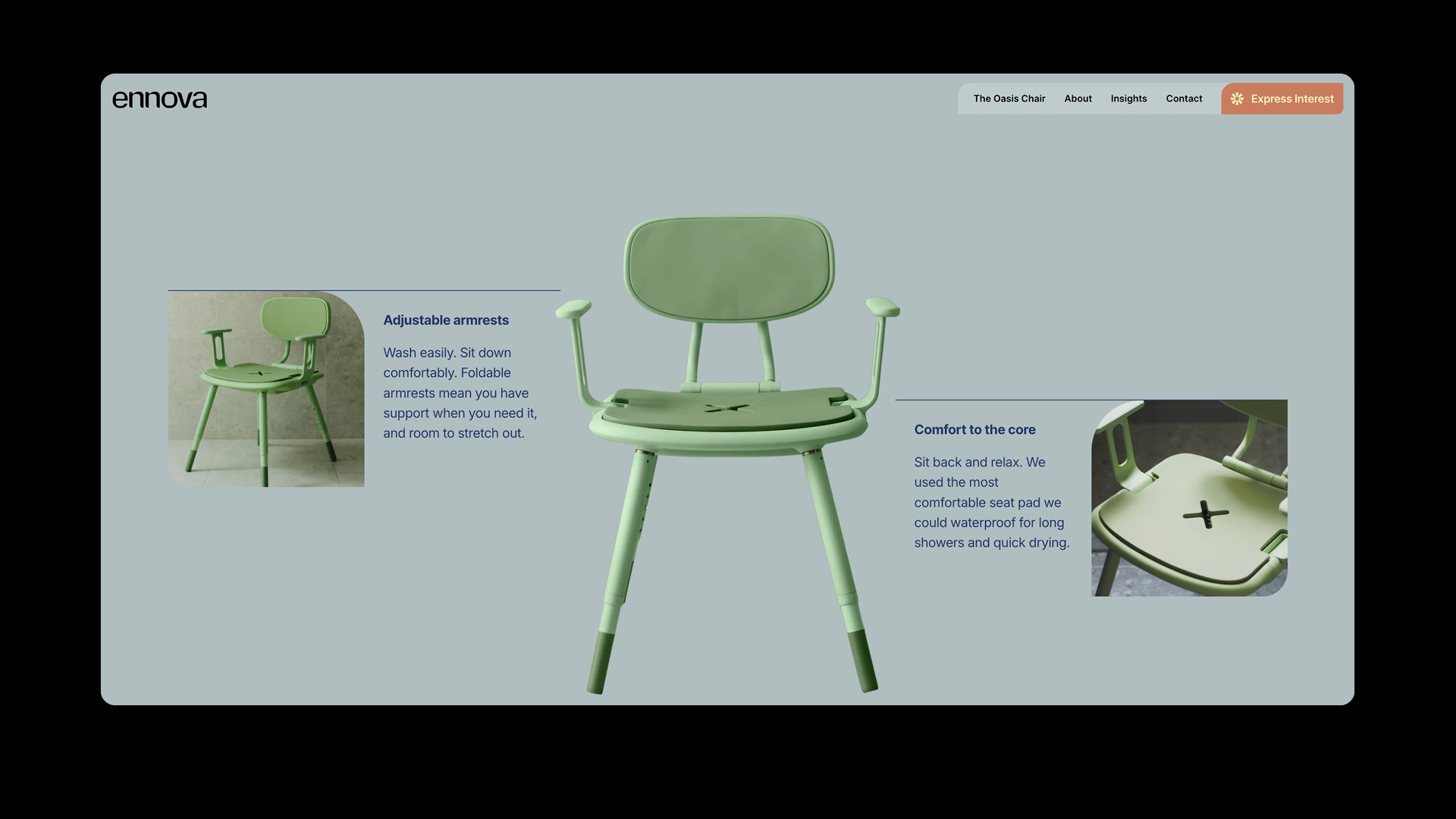
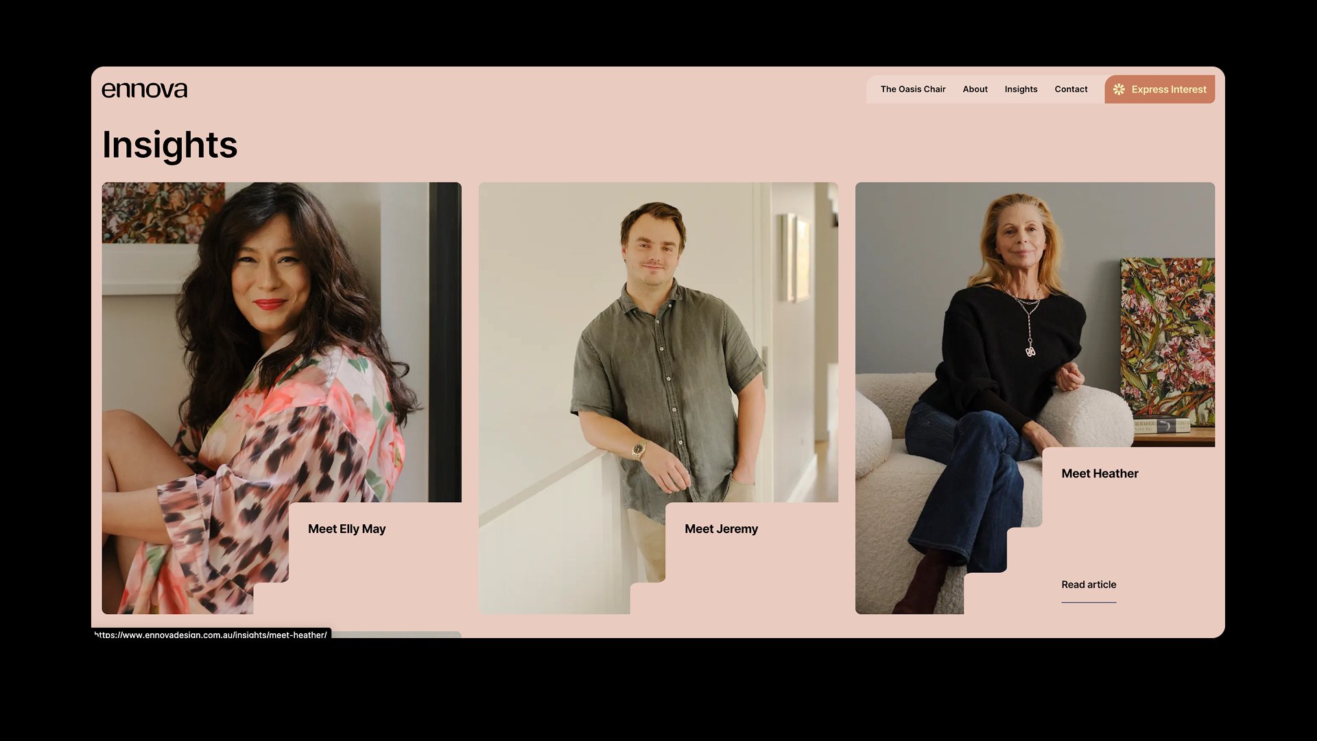
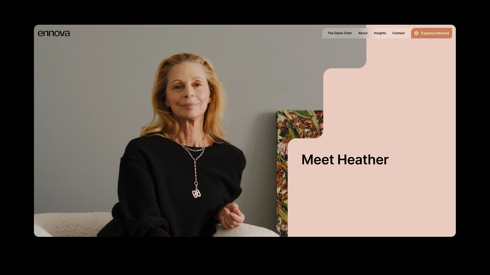
Website Design
We established the site architecture working closely with the Ennova team, planning for an early brand launch and designing a website to promote the business in preparation for its first product launch. Meanwhile, we completed every aspect required for e-commerce and complex purchase journeys, ensuring scalability for future growth. We collaborated with the Ennova team and the developers to design a focus on clarity, approachability, and user-friendly navigation. The e-commerce site is to be launched in Autumn 2026. Development by RBU Digital.
“A truly collaborative process with a creative partner who really knows their craft. As an assistive technology brand, getting the balance right was critical. They took the time to understand Ennova – what we stand for, who we’re designing for, and why that matters.”
Eilish Parsons - Director & Co-Founder

